Feminine Label Design for Yarba Herboristerie
Moldova’s first and only herboristerie, which is called Yarba, started as a celebration of natural remedies, tradition, and feminine wisdom.
The owner, Irina Buga has first approached us wanting a little touch up on the logo. We started our colab there and ended up creating numerous copy materials for the brand, but also brochures, flyers and social media posts, ending in creating a whole identity for an all-natural line of eco and artisanal products.
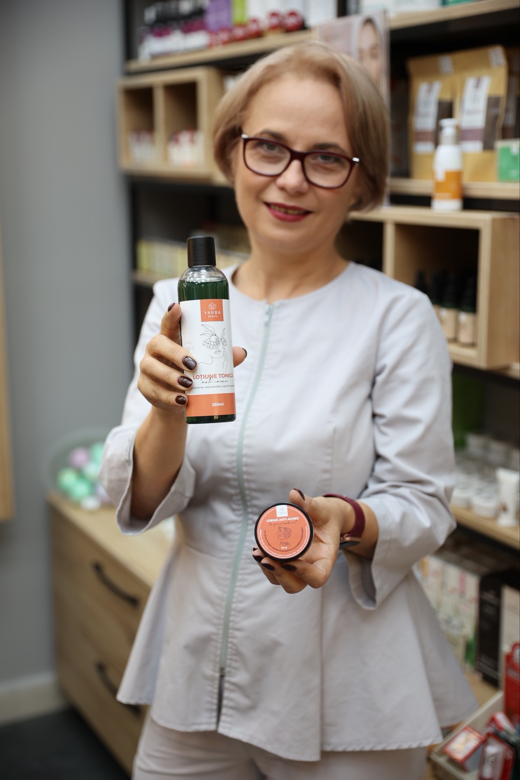
The label design had to reflect Yarba’s essence: gentle cosmetics with deep roots in botanical heritage.
YARBA: Labels That Speak to the CUSTOMER
This design packaging had to appeal to women who valued natural remedies, elegance, and just a spark of authenticity.
We began with an in-depth branding session, exploring the emotional and visual language of the YARBA brand. We also settled on some important parts from the brief:
YARBA BEAUTY is the natural cosmetics line that brings together pharmaceutical knowledge and the science of plants. It’s the kind of heartfelt recommendation a good friend, who truly cares for you, would make without hesitation. Far from being expensive, these hair, body, and facial care products fulfill the desires of the modern woman: they brighten the gaze, restore harmony, and revive self-confidence.
DETAILS THAT MATTER
Yarba Beauty products are entirely made in the Republic of Moldova, following original formulations that respect the body’s balance—harmonizing modern chemistry with the wisdom of plants.
The dream of Irina Buga, founder of the YARBA line and herboristerie, was simple yet bold—to open Moldova’s first para-pharmacy. She envisioned a space where every shelf would offer natural, healing solutions.
Over the years, hundreds of products passed through her hands. As a pharmacist and founder of her own herboristerie, Irina had a clear advantage. She listened closely to women and learned exactly what they look for in cosmetic products—what they want, but often struggle to find.
That’s how YARBA Beauty came to life. A line of perfectly balanced products, crafted by a woman, for women, designed especially for those who trust and love nature.
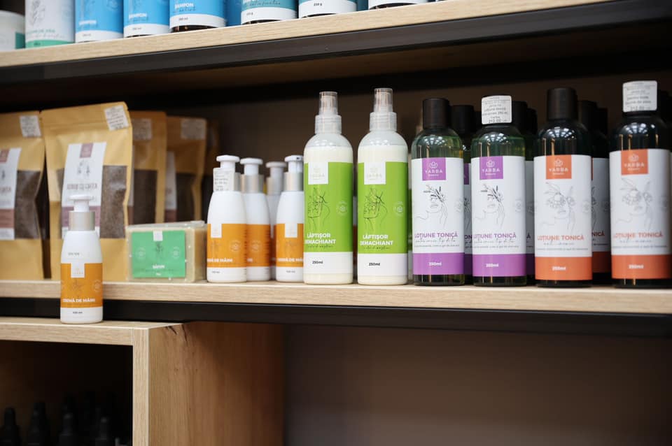
From cleansing creams and milks to bath salts, scrubs, and gentle soaps, the collection invites women to enjoy peace and relaxation through natural beauty rituals. And they can do it all in the comfort of their own home.
Today, YARBA Beauty features over 21 handcrafted products. Each one reflects Irina’s commitment to quality, balance, and feminine wellness.
With YARBA’s values and customer in mind, we set out to create a label design that felt authentic, feminine, and connected to nature.
Our creative direction centered around three key elements:
-
A muted, earthy color palette with soft, elegant accents
-
Delicate botanical illustrations, inspired by Moldovan flora and the plants used in each product
-
Handwritten-style typography that adds an artisanal and personal touch
To maintain a clean, transparent look, we also developed space-efficient layouts. These ensure that ingredients and key information are easy to read, while keeping the design visually refined.
Good Label Design Matters
We can’t say this enough! We’re proud to have partnered with YARBA in shaping their visual identity and elevating their shelf presence. Through the process of label design and branding, we helped transform Irina’s visionary idea into reality!
If you are launching your own natural product line drop us a line HERE! We love to write new brand stories like these that cross the lines and …borders!


